
Apple Pay Split Pay Added Feature
Case Study 3

It all begins with an idea. Maybe you want to launch a business.
Problem
Building points on different credit cards and having more equitable financial options to pay for lower-income families can be very limiting when there aren’t a split payment feature on Apple Pay.
My Role
User Research, Information Architecture, Wireframing, Branding, UI Design, Prototyping, Usability Testing
REASEARCH
Goal
To design and implement a bill splitting feature to online transaction for Apple Pay websites and applications. I will ensure to add this feature without interrupting the existing flows or deviating from the brand norms for consistency.
Methodology
To better understand the user process and needs in a more equitable and user-friendly experience, I conducted the following 3 data collections with five Apple Pay users from different levels of experiences. Most of them we're from different part of Minnesota, they were all in their late to early thirties:
Comparative Analysis - to see how event planners are using the service in person.
User Interviews - to hear from users firsthand their stories of how they use the service and what role it plays in their (work) lives. These can be part of, or in place of, contextual interviews depending on circumstances.
Surveys - to get more objectives answers.
Affinity Map
Comparative Analysis
After analyzing and evaluating my affinity map and comparative analysis, I discover some important user and applications insights that allow me define essential user needs. I discovered:
The importance of having skin care products ingredients
How to track users skin care journey corresponding with age and skin care focuses, i.e.: acne, wrinkles etc.
Utilizing visuals to help provide user application instructions
Define
User Persona
After meeting with my target audience and gaining insights from the interview phase, I created 2 user personas that reflected the user base. I decided to showcase one user persona on Steve H. on this website who has similar concerns and needs as most target audiences.I decided to focus more on the technical factors that drives and frustrate him to showcase his full experience.
IDEATE
Wireframe
From the outcome of my research and my user persona, I moved to create a wireframe of the purchasing page that leads into the split payment options in the Apple Pay app. I decided on a wireframe to allow myself to visualize the features when it is still at the beginning of the design and permit for modifications as needed. This is super helpful for visual learner to the contents and how they connect.

Task Flow
After the wireframe I mapped out the user's task flow using the existing navigation structure in the wireframe. This task flow breakdowns the user's experience task by task and help to identify any challenges.
User Flow
To provide more clarity and understanding on the user decision making process and experience, I created a user flow that correlates with the task flows. This process allowed me to think more critically on the specific interactions the users might engage in and bring up any pains and or difficulty flows. Below showcase the user flow for Steve to make a split payment on Apple Pay.
High-Fidelity Wireframe
To provide more clarity and understanding on the user decision making process and experience, I created a user flow that correlates with the task flows. This process allowed me to think more critically on the specific interactions the users might engage in and bring up any pains and or difficulty flows. Below showcase the user flow for Steve to make a split payment on Apple Pay.
Branding
After completing the high-fidelity, I moved my focus on bringing characteristics and identity to the Split Payment feature on Apple Pay.
Logo
With Apply Pay already have its own brand and logo I just adopted the Apple Pay logo that way the branding stay consistent and cohesive.

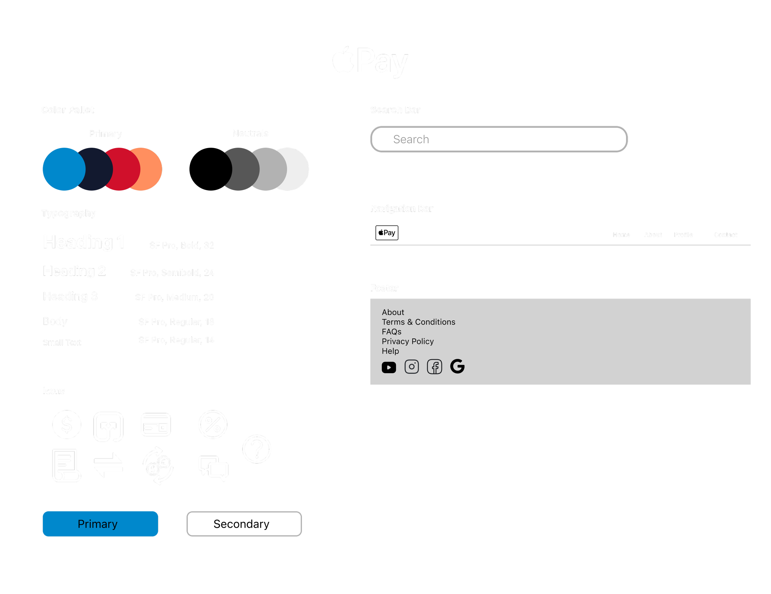
Styleskape
Color Pallete
Same as the logo, Apply Pay already have its own color palette. I just adopted the Apple Pay color palette.
Once the logo and color palette was created I combined it with the typography, illustrations, iconography, and textures/shapes. Some of the icons are new as the split pay is a new feature to Apple Pay and requires new icons.
Revisions
After the usability testing, prototyping, and ideating I decided to go with revision 2. From my usability testing 3 out the 4 have exclaim that it didn’t make sense to have a total cost payment option if the user already wants to split the cost. Therefore, i made that change to Revision 2 where the total cost payment option is removed. This makes the more sense for user when selecting the split option.

Final Design

Outcomes
Usability Test
I recruited 4 individuals, in different part of their skin care journey, as participants to test my designs. I made sure to recruit user in different point of their skin care journey because I want to ensure that this application is user friendly to beginners and experts skin care user. The goal of the usability test was to learn whether the navigations of the split pay, aesthetics and CTAs were effective and clear.
Here are some of the insights discovered through the test:
Color Palette was consistent to the Apple branding.
CTA are easy to see with the appropriate size making the flow and direction easy to follow.
Remove the total cost option from the split payment option as it doesn’t make sense.
Reflection
Creating a split payment feature for Apple Pay was delightful as I am an active user of Apple Pay. Also, knowing that split payment option is such a prominent feature that users utilize often, I am delighted to bring this feature into existence. More importantly, also addressing the concerns of financial equity, to allow low-income household the options to purchase bigger cost item(s), was crucial in creating this spilt payment option for Apple Pay. Growing up in a low-income house hold I know the frustration of not affording item(s) because of cost.
As a result, I am looking forward to see this added feature become a actual feature to Apple Pay in hopes that users will have a more equitable and efficient way to make payments.
The followings are some key takeaways from this project:
Efficiency is success:
This split payment options showed me how important efficiency is to ensure the fall through of users purchases. This was very evident during the usability testing where participants of the usability test express their frustration with the options to pay total cost when they wanted to split the payment cost. This made them hesitate with goring through with the payment.
Bringing Apple Pay Split Payment International:
When designing the split payment options for Apple Pay I only thought of domestic banks and it utilization within the US. However, knowing that Apple Pay is use intentionally, I believe it is important to eventually expand this internationally.