
Case Study 2
AC Restaurant & Bar Responsive Website
Problem
Searching for ingredients on a restaurant website can be challenging, especially when a consumers has multiple food restrictions/allergies.
My Role
User Research, Information Architecture, Wireframing, Branding, UI Design, Prototyping, Usability Testing
RESEARCH
Goal
I want to know how consumers conduct their process of searching for ingredients for food allergy to inform my understanding on the short sights and what services are desirable in a restaurant website to provide insights on addressing them.
Methodology
To better understand the user process and needs in finding the right restaurant with specific food ingredients, I conducted the following 3 data collections with six consumers. Most of them we're from the mid-west, they were all in their late twenties and early thirties:
Contextual interviews - to see how consumers are using the service in person.
User Interviews - to hear from users firsthand their stories of how they use the service of of searching for a restaurant with specific food ingredients and what role it plays in their (personally) lives. These can be part of, or in place of, contextual interviews depending on circumstances.
Surveys - to get more objectives answers.
Affinity Map
With the completion of the interviews I created an affinity map to help me synthesize my findings to see the similarities in patterns and themes among my six participants. Through this I was able to retrieve insightful high-level information on the users frustration and needs.
Comparative Analysis
A comparative analysis was conducted to provide more context on other competitor. Through this method I was able to identify the gaps and improvements that are needed for event planners.
After analyzing and evaluating my affinity map and comparative analysis, I uncover some important user and applications insights that allow me define essential user needs. I discovered:
How to have multiple applications more interchangeable in one restaurant site
How to ensure all food and beverages listed ingredients for allergen purposes
Utilizing social media in a consistent way and timely manner to allow easy reservations and information
DEFINE
User Persona
After meeting with my target audience and gaining insights from the interview phase, I created user personas that reflected the user base. In doing so I create a user persona on Phoua who I believe encompasses the significant needs and wants of the target audiences. For her I focus on her backgrounds and emotional factors that drives and frustrate Phoua to showcase her full experience.
IDEATE
Wireframe
With the completion of my research and my user persona, I created a wireframe of the food ingredient search page and one on the event creation page. I decided on a wireframe to allow myself to visualize the features when it is still at the beginning of the design and permit for modifications as needed. This helps me tremendously to see where contents are and how they connect, especially being a visual learner.
Task Flow
After the wireframe I mapped out the user's task flow using the existing navigation structure in the wireframe. This task flow breakdowns the user's experience task by task and help to identify any challenges.
User Flow
To provide more clarity and understanding on the user decision making process and experience, I created a user flow that correlates with the task flows. This process allowed me to think more critically on the specific interactions the users might engage in and bring up any pains and or difficulty flows. Below showcase the user flow for Phoua to find a food ingredients and create an event reservation.
Low Fidelity Wireframe
In addition to the wireframes and task/user flows, I scaled up my designs to create low-fidelity wireframes. The foundation of this low-fidelity came from the ideation of the wireframe.
BRANDING
After completing the low-fidelity, I moved my focus on bringing personality and identity to AC Restaurant and Bar in collaboration with the owners.
Logo Sketch
The color red and Hmong symbolism was a recurring identity theme that the owners brought up for the logo. Therefore, I knew that I wanted to highlight a Hmong motif to create an innovative combination of the letter A and C. The Hmong heart motif was the perfect motif to capture the theme and branding of AC Restraint and Bar.
Stylescape
Combining the logo, color, typography, illustrations, iconography, and textures/shapes, I created a Stylescape. The stylescape is to inform the aesthetic and emotion of the brand for AC Restaurant and Bar. When collaborating with the owners, stylescapes will demonstrate the design direction of the website, while creating opportunities for iteration to effectively deliver and embody the owners expectations for the project.
Color Palette
With the owners we wanted to capture the Hmong color palette and the essence of strength, pride and home that will allow user to feel and know that they can achieve their goal with the site. This is why we decided on with these particular primary and secondary colors. Options 1 and options 2 were created, but ultimately the owners decided to go with options 1 that truly embodies the characteristics of what they want their users and guests to experience.
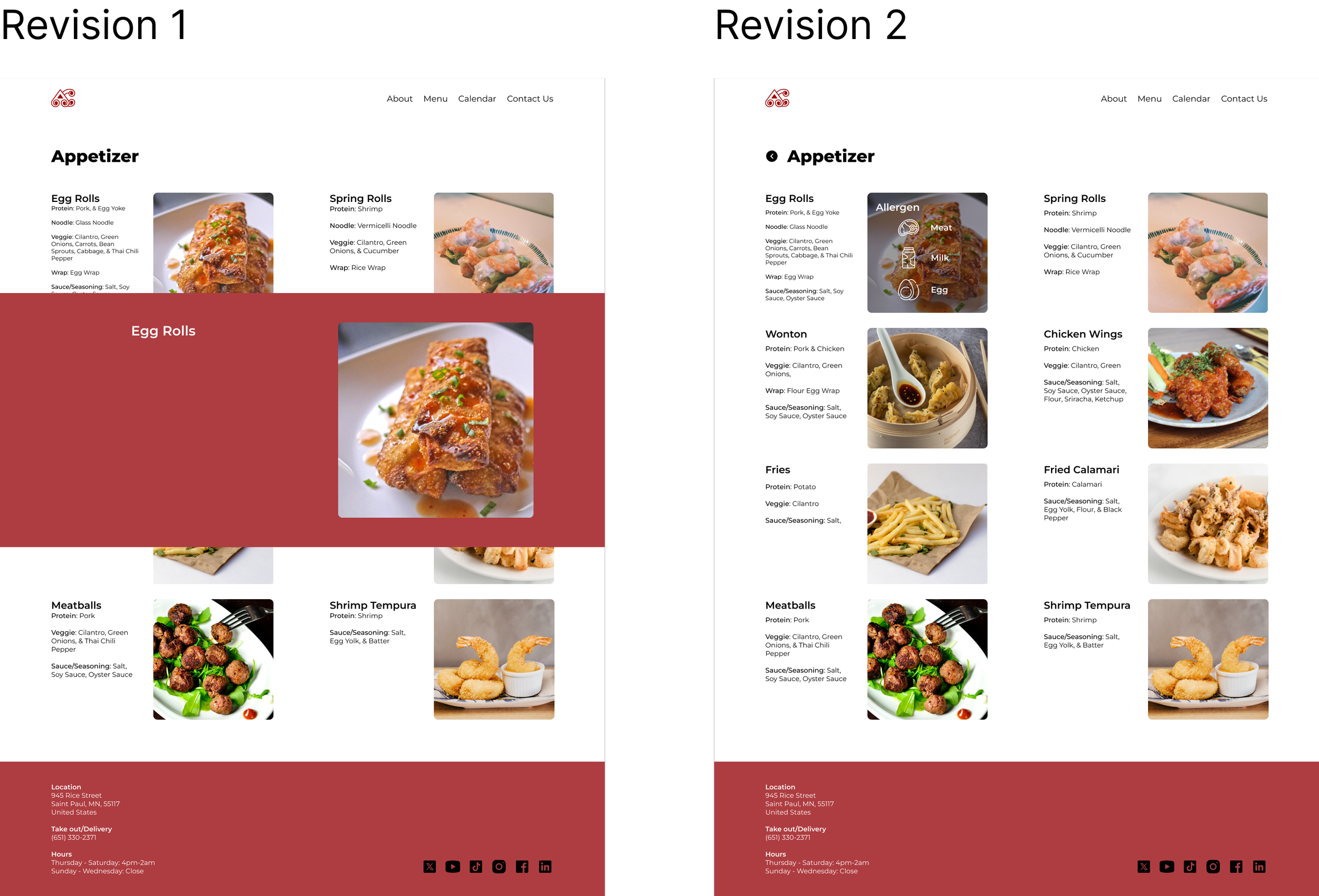
Revision
After the usability testing, prototyping, and ideating I decided to go with revision 2. From my usability testing some have exclaim that it was too much steps having to click on the picture or the word to get the allergen information. The overlay also made it hard for some user to see as it can be distracting. Therefore, revision 2 came and overlay on just the specific food photo made it much more accessible and easier to view. As a result, the owner and I decided that revision 2 is the best represent their restaurant and bar while making accessibility easier.
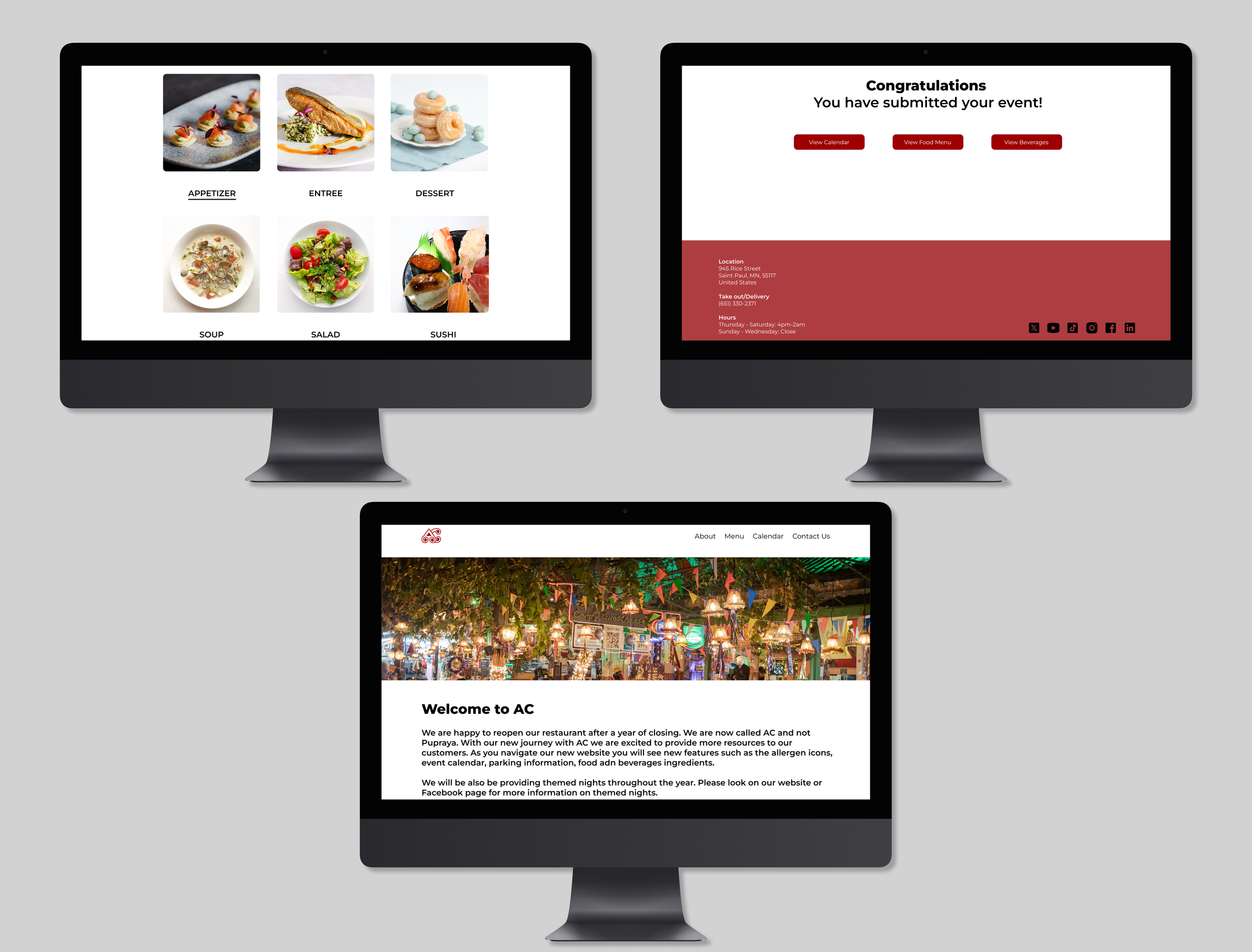
FINAL DESIGN

OUTCOMES
Usability Test
To ensure the website is functional I recruited 4 individuals as participants to test my designs. I was intentional on recruiting these particular individuals since they all have a different level of interest in online shopping because I want to ensure that this application is user friendly to all level of online shoppers. Moreover, I wanted to also learn from the first hand experience of my target user (online shoppers). The goal of the test was to learn whether the main navigations, aesthetics and CTAs were effective and clear.
Here are some of the insights discovered through the test:
The navigation was easy to follow for searching for food ingrediants.
Color Palette makes it easy to view and matches the logo well and theme.
Overall layout of the calendar is user friendly and easy to search and make an reservation.
Adding different category for the foods so user can search base on that.
Making the allergen information easy to access with less steps to get to.